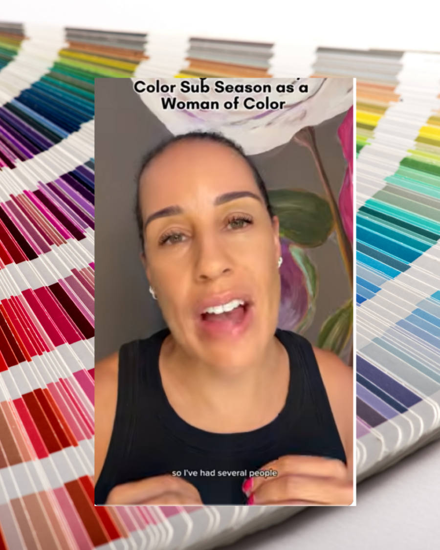







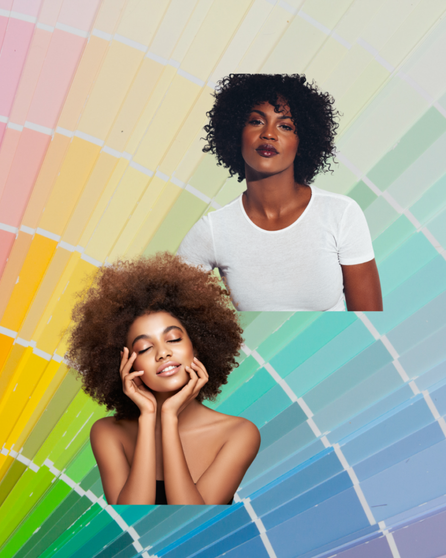
At its core, color analysis is about figuring out which colors work in harmony with your natural coloring. The right colors can make your complexion look clearer, your eyes more defined and even your natural lip color look more vibrant.
Sounds simple enough, right?
Well… it can get a little tricky. 
Especially for women of color, because sometimes you look at those traditional color charts and think… okay, but where do I fit?
That was definitely my experience.
When I first started looking into seasonal color analysis, I kept seeing the same types of examples over and over again. And when women with deeper skin tones were included, there seemed to be this automatic assumption that deeper skin meant you had to belong in one of the Deep seasons.

But your color season isn’t determined by how light or dark your skin is.
One of the biggest things I learned through this process is that your overtone and undertone are not necessarily the same thing.
My skin has a golden appearance, so at first glance it would be very easy to assume that I’m warm. But color analysis isn’t really about whether your skin looks warm or cool. It’s about how your skin responds to warm and cool colors.
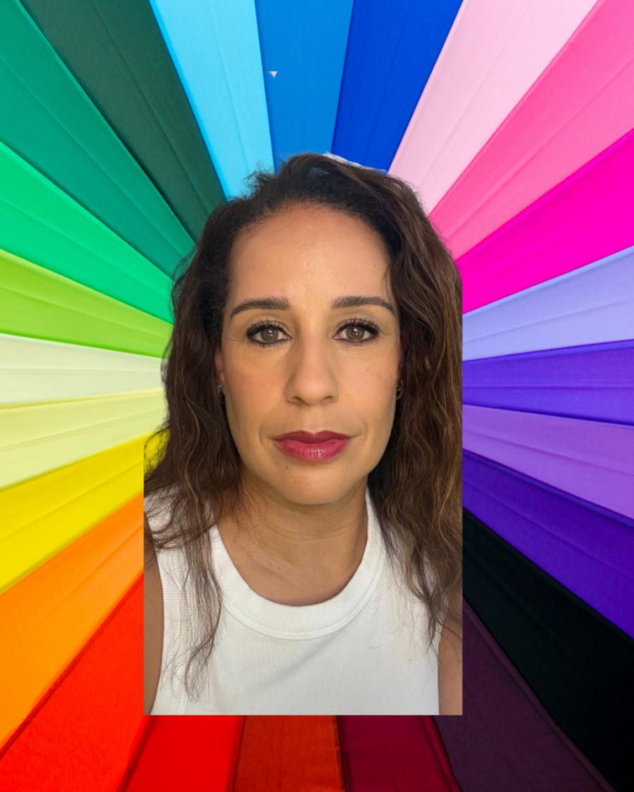
So how can you start figuring out your own?
One of the easiest places to start is with photos of yourself in really good natural lighting. And yes—the car is one of my favorite places to do this.
If you can, take the pictures without foundation so you can really see what the colors are doing to your natural complexion.
Then start comparing very different colors.
Try black and navy. A crisp white. Icy pink. A softer light pink. Purple. Cobalt or royal blue. Hot pink.
Then go in the opposite direction and try warmer colors like orange, coral, rust, camel, mustard or warm beige.
But here’s the important part:
Don’t just ask yourself, “Do I like this color?”
Look at your face.
Does your complexion look clearer?
Do your eyes suddenly look more defined?
Do the whites of your eyes look brighter?
Does your natural lip color become more noticeable—or does it seem to disappear?
Does the color cast yellow, orange, gray or even green onto your skin?
Look around your jawline and underneath your chin too. Sometimes you can actually see the color reflecting upward onto your face.
And these differences can be really subtle.
You may not throw on one blue shirt and suddenly yell, “I’m a Winter!”
For me, cobalt blue was one of those colors that made me stop and think, Okay… something is happening here.
My complexion looked clearer. My eyes became more pronounced. My natural lip color seemed stronger and my features looked more defined.
Then I would put on certain warmer colors and get a completely different effect.
Instead of seeing me first, I saw the color.
That became a clue.
Pay attention to brightness, too.
Can you wear something like royal blue, hot pink or another highly saturated color and still see your face first?
Or does the color walk into the room before you do?
Then try softer, muted colors.
Do they blend beautifully with you—or do they make your complexion look a little dull?
Those comparisons start giving you information about whether you need colors that are warmer or cooler, brighter or softer, deeper or lighter.
Technology can help—but don’t let it make the decision for you.
I also used AI to help me work through the seasons and subseasons.
I uploaded what seemed like at least 30 photos of myself in different colors to ChatGPT and started looking for patterns—which colors made my face look brighter, my jawline look more refined, my natural lip color look more vibrant and my eyes look more pronounced.
But I wouldn’t rely on technology alone.
Some color analysis apps seem to focus heavily on your overtone or the depth of your complexion. For women of color especially, that can lead you right back to the assumption that deeper skin automatically equals a Deep season.
Your actual reaction to color tells you so much more.
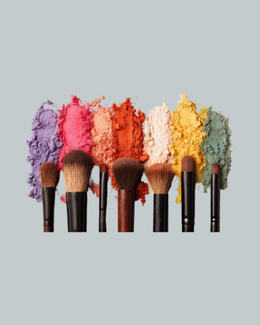
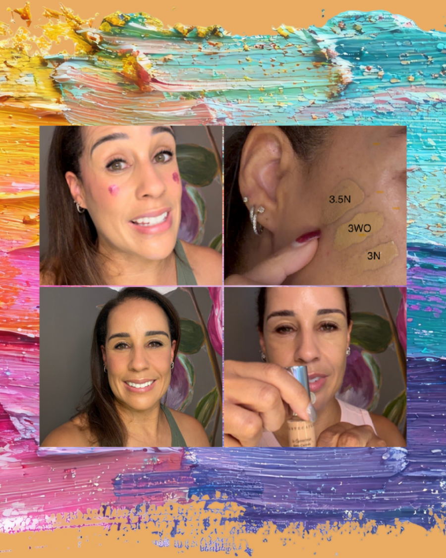
And honestly, one of my biggest clues came from my makeup.
For the longest time, I thought I had a makeup problem.
Why did bronzer always seem a little too heavy?
Why did warm brown eyeshadow never really do anything for my eyes?
Why did peach and coral blushes sometimes feel like they were sitting on top of my face instead of working with it?
And then I’d put on a raspberry, berry or cool pink blush and suddenly everything just made sense.
Lipstick can give you clues too.
If a caramel or warm nude lip constantly feels like it needs more liner, more blush, more bronzer or just something else to make it work, pay attention to that.
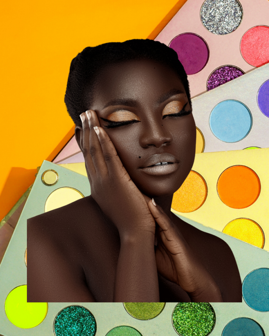
Then compare it with a berry, mauve, blue-red or cool pink lip.
Does your face suddenly look more alive?
Your makeup may have been quietly giving you clues about your color season for years.
Once I started looking at all of those clues together, I realized that cooler, clearer colors consistently enhanced my natural features more than warmer shades did.
That’s how I eventually realized I’m a True Winter.
Not because I found someone on a chart who looked exactly like me.
Not because I have dark hair or deeper skin.
And definitely not because an app assigned me a season.
I got there by paying attention to what the colors were actually doing to me.
So if you’re curious about color analysis but have no idea where to start, experiment.
Take some photos in natural light. Compare colors side by side. Look at your eyes, your lips, your complexion and your jawline. Notice the colors that seem to bring you forward—and the colors that seem to wear you.
And if you still can’t quite figure it out, there’s absolutely nothing wrong with booking a professional color analysis. Sometimes having another set of trained eyes can help you see what you’ve been missing.
But whether you DIY it or work with a professional, try not to start with the question:
“What season does someone with my skin color belong in?”
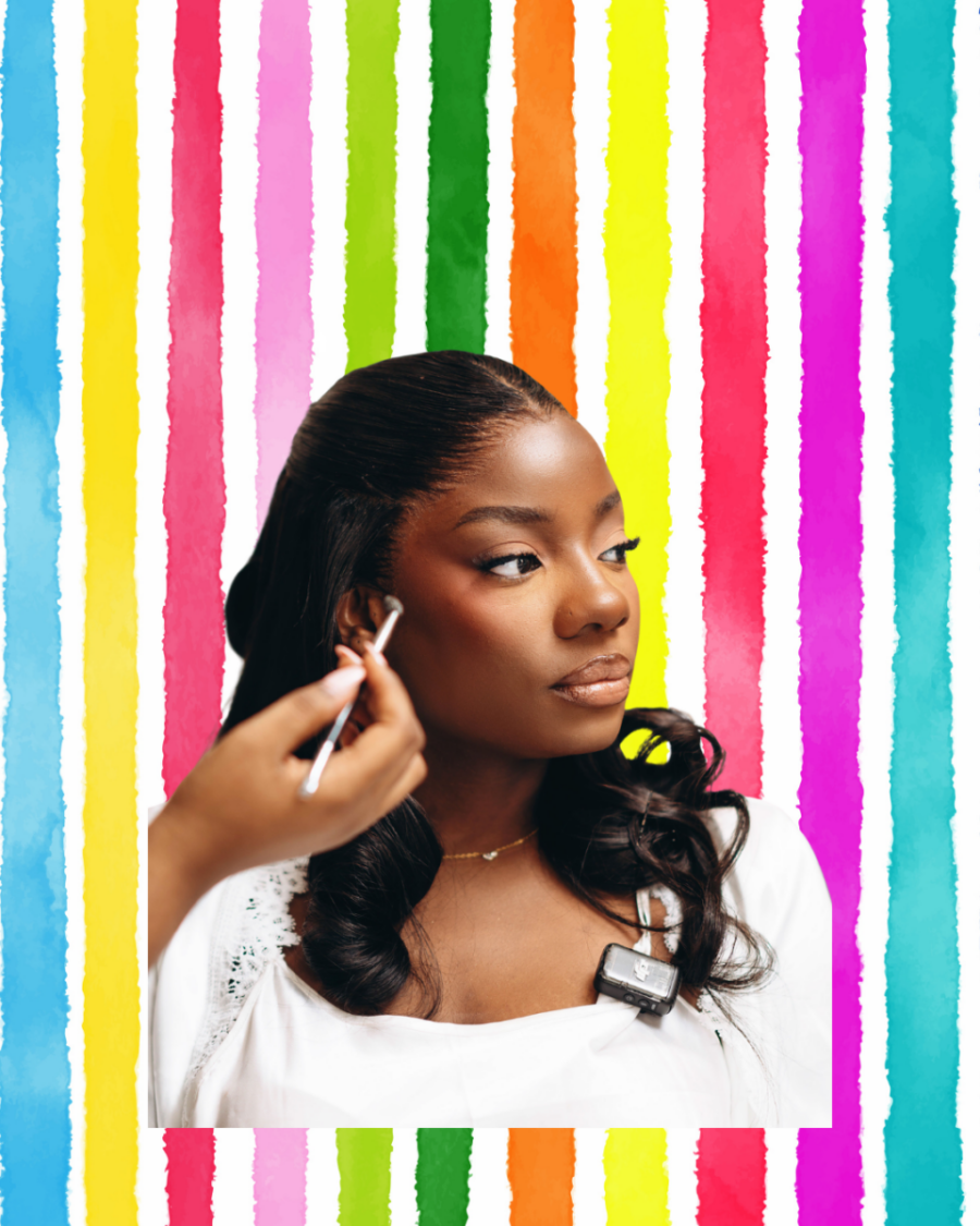
Start with:
“What happens to my face when I wear this color?”
Because melanin doesn’t assign you a season—and no chart can know your coloring better than your own face.
How I Figured Out My Color Season as a Woman of Color | True Winter Color Analysis**